.webp)
Overview
Understanding the problem
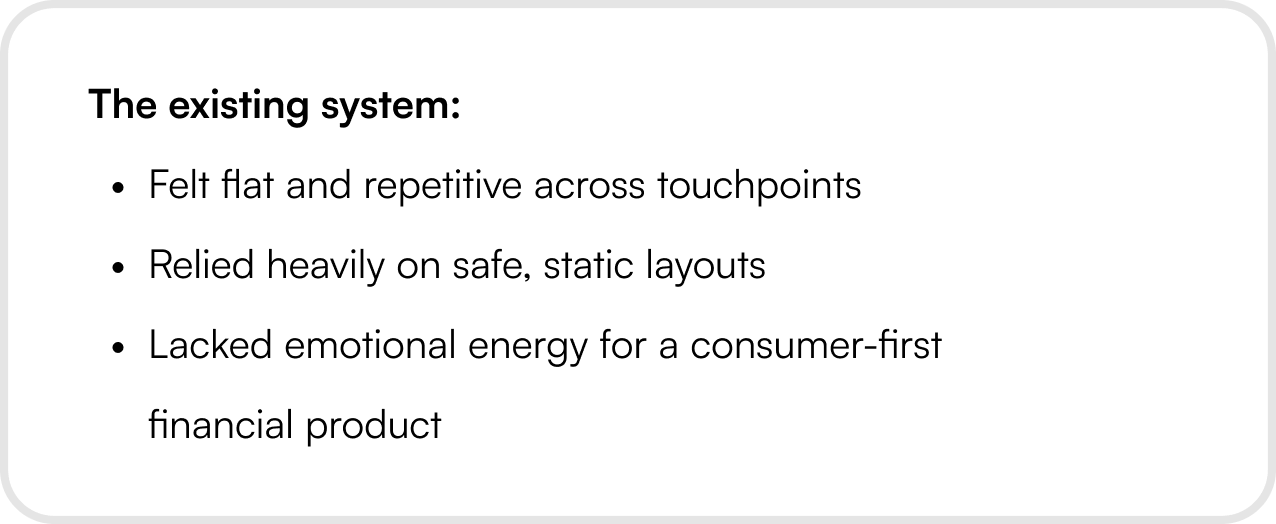
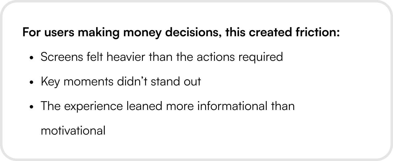
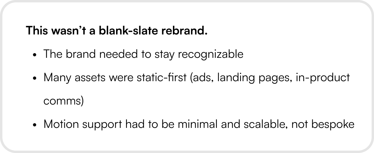
Yellow Card’s B2C product was functionally solid, but visually it wasn’t pulling its weight. We needed to increase visual energy without compromising trust or clarity.
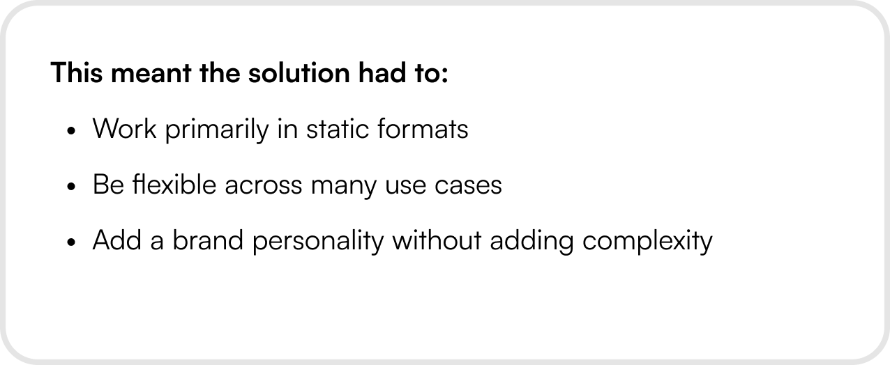
Constraints & Realities
Services

Tools

%201.webp)

Year
Marketing Refresh with Yellow Card
Understanding the problem
Yellow Card’s B2C product was functionally solid, but visually it wasn’t pulling its weight. We needed to increase visual energy without compromising trust or clarity.
Constraints & Realities
Services
Tools
Year
Marketing Refresh with Yellow Card
Services
Tools
Year
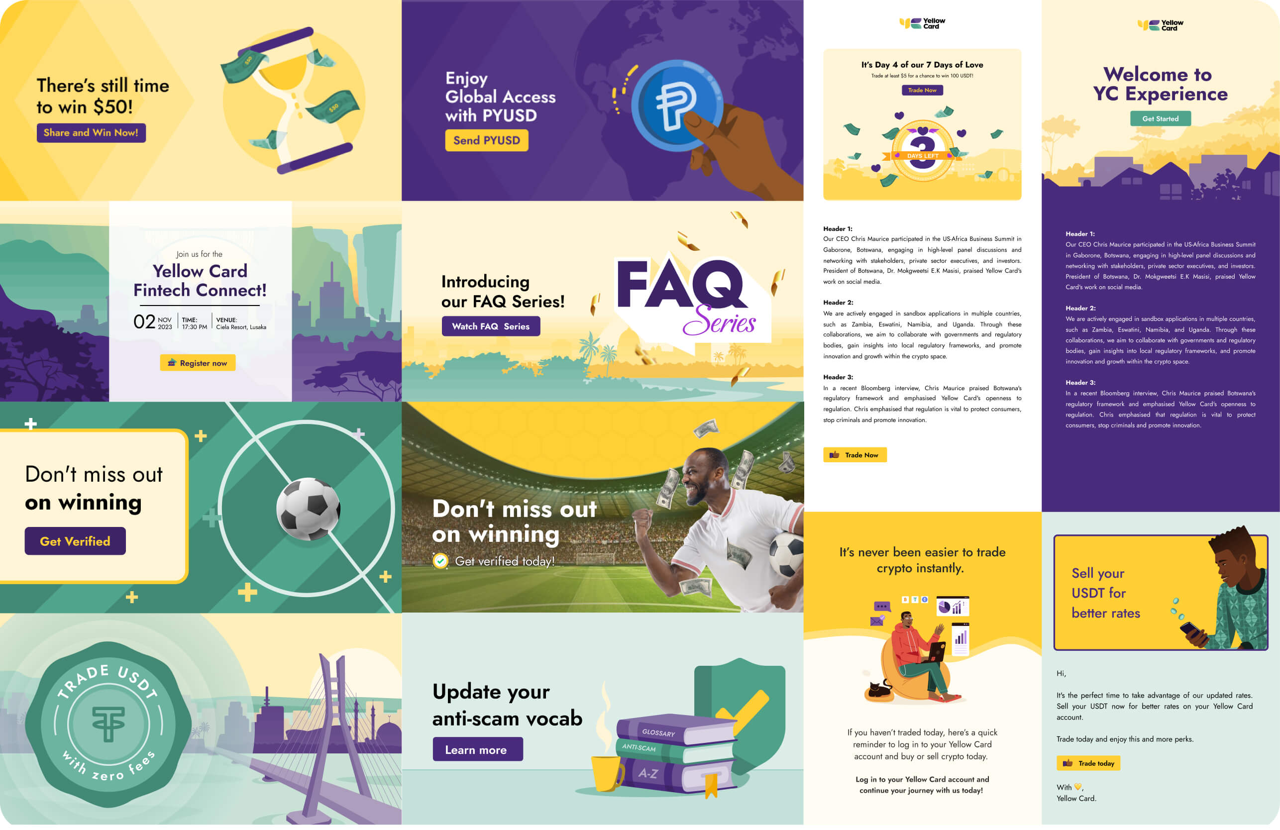
Current Visual Direction
Yellow Card’s B2C product was functionally solid, but visually it wasn’t pulling its weight. We needed to increase visual energy without compromising trust or clarity.

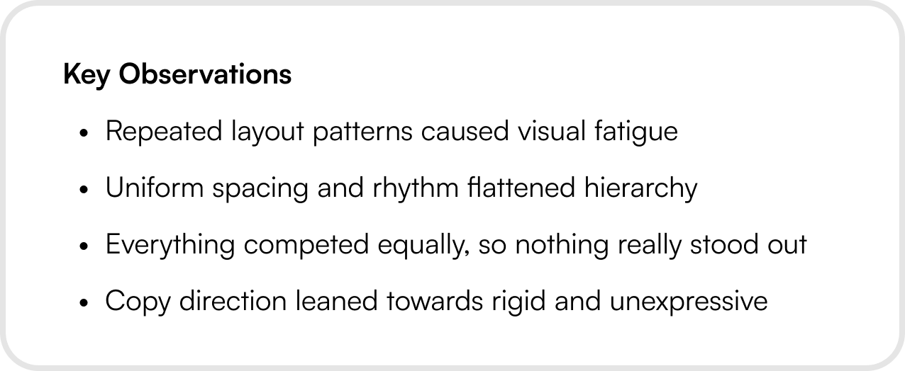
Learning & Exploration Phase
Instead of jumping straight into new visuals, we stepped back and looked at why things felt stale. We learned that the issue wasn’t color or typography — it was lack of contrast, rhythm, and variation.
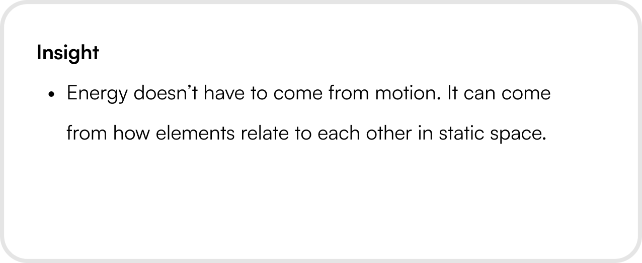
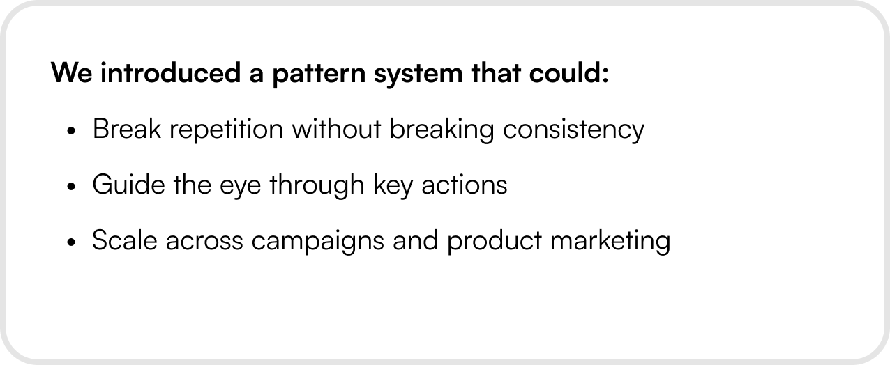
How It Came Together
The design direction focused on bringing movement into static layouts. These patterns weren’t illustrations and gradients, they were structural tools.
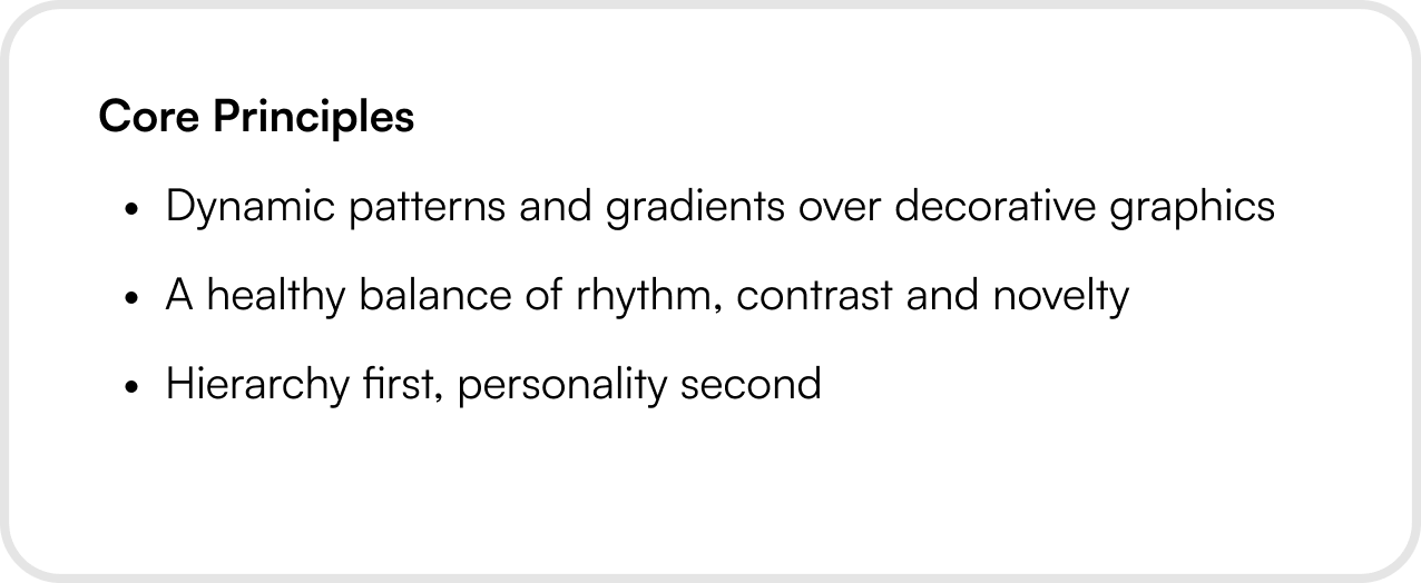
New Visual Direction
The design direction focused on bringing movement into static layouts. These patterns weren’t illustrations and gradients, they were structural tools.


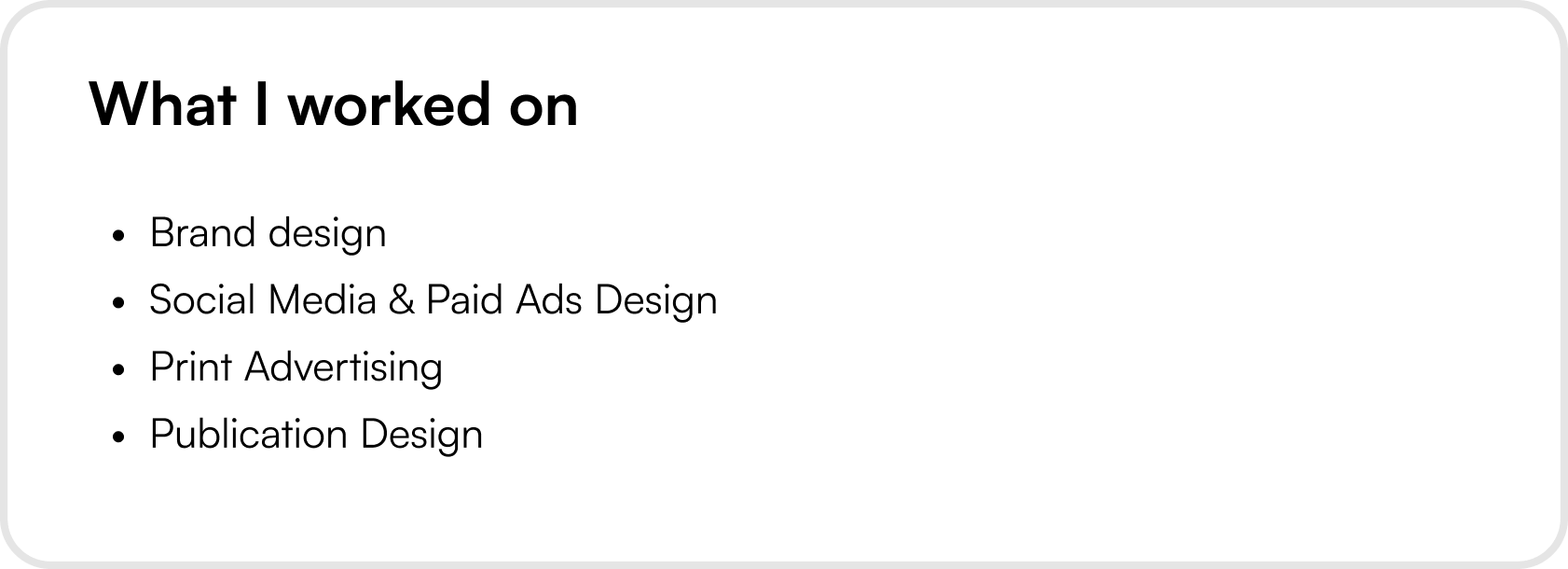
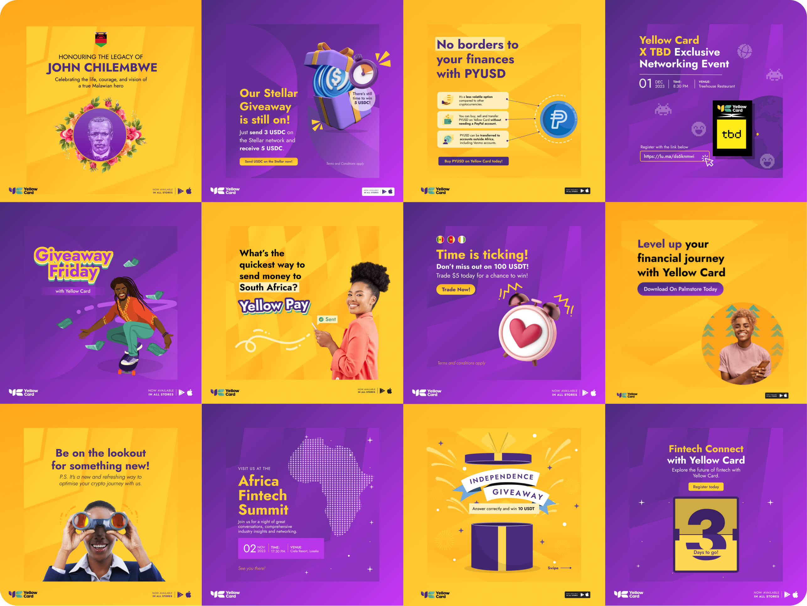
Social media and Paid ads
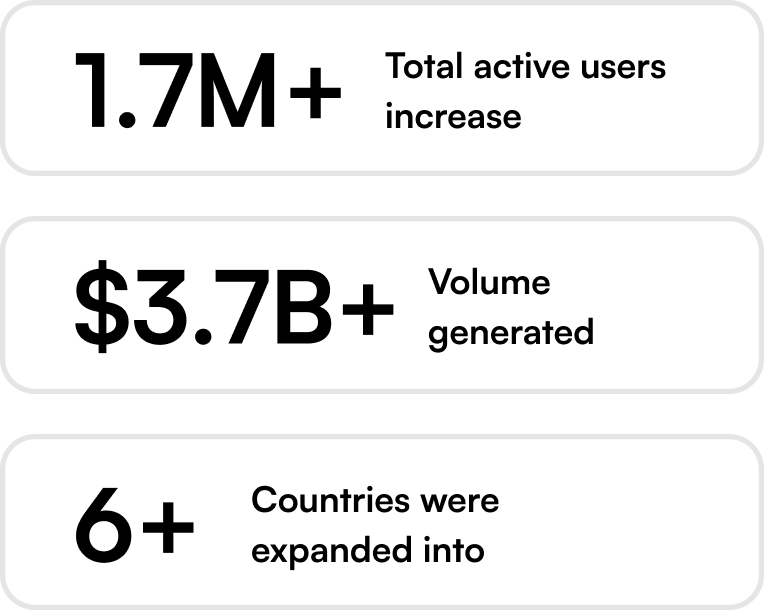
Designed over 1000+ social media and paid designs for over 20 countries ranging from campaign designs, social engagement post designs, partnership posts to announcement posts
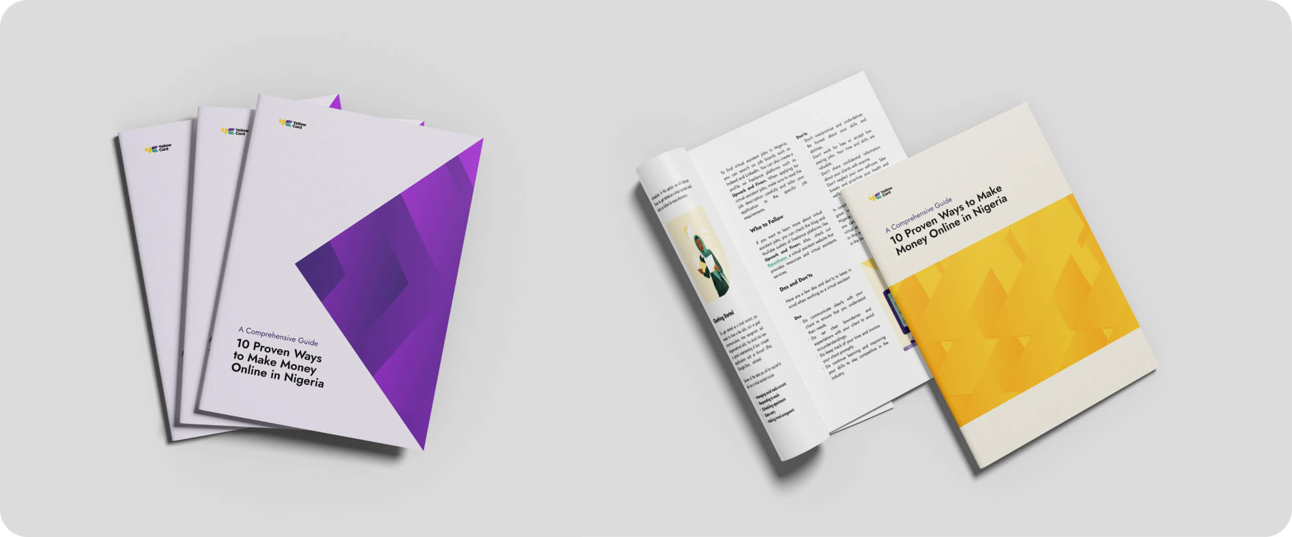
Publication designs
Designed over 20+ publication designs for over 20 countries.
Email/Email header Designs
Designed over 500+ email designs for over 20 countries which included promotional, activation, educational, engagement, retention, compliance & security and transactional emails.
Outcome
Made screens feel lighter and more engaging. Improved clarity and visual flow across B2C touchpoints. Gave the brand more personality without losing trust. More importantly, it created a reusable visual language that teams could apply consistently without heavy design overhead.
Reflection & Learning
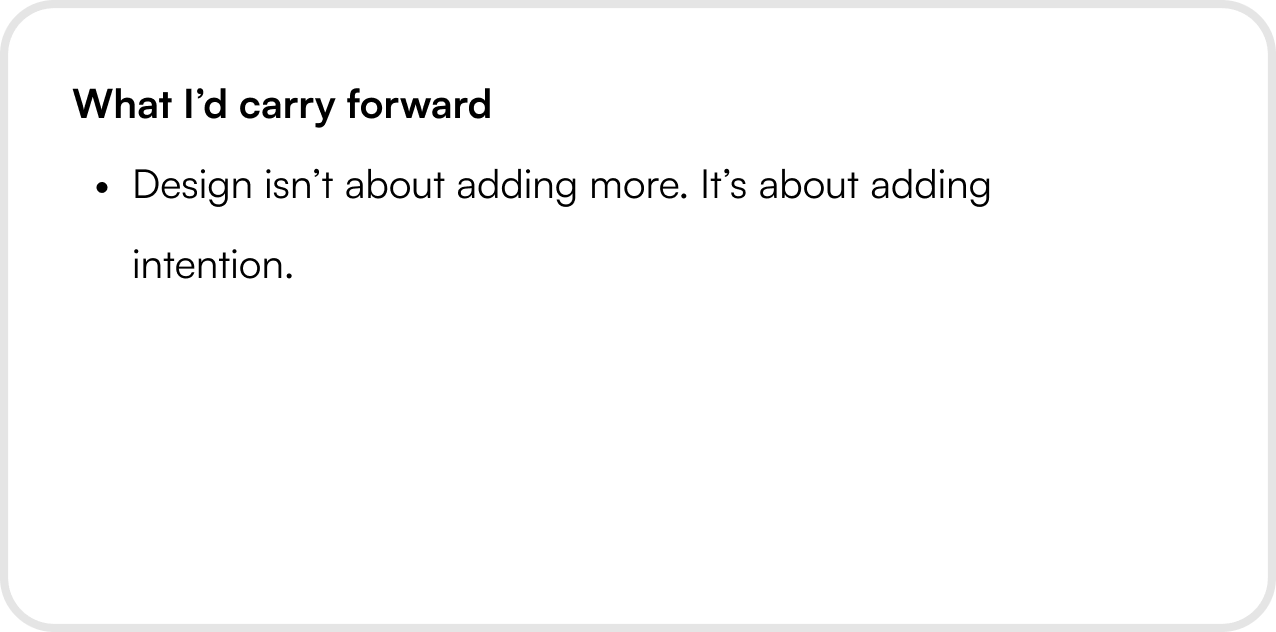
This project reinforced my belief that in financial products, clarity earns trust — and thoughtful visual energy earns engagement.
Current Visual Direction
Yellow Card’s B2C product was functionally solid, but visually it wasn’t pulling its weight. We needed to increase visual energy without compromising trust or clarity.
Learning & Exploration Phase
Instead of jumping straight into new visuals, we stepped back and looked at why things felt stale. We learned that the issue wasn’t color or typography — it was lack of contrast, rhythm, and variation.
How It Came Together
The design direction focused on bringing movement into static layouts. These patterns weren’t illustrations and gradients, they were structural tools.
New Visual Direction
The design direction focused on bringing movement into static layouts. These patterns weren’t illustrations and gradients, they were structural tools.
Social media and Paid ads
Designed over 1000+ social media and paid designs for over 20 countries ranging from campaign designs, social engagement post designs, partnership posts to announcement posts
Publication designs
Designed over 20+ publication designs for over 20 countries.
Email/Email header Designs
Designed over 500+ email designs for over 20 countries which included promotional, activation, educational, engagement, retention, compliance & security and transactional emails.
Outcome
Made screens feel lighter and more engaging. Improved clarity and visual flow across B2C touchpoints. Gave the brand more personality without losing trust. More importantly, it created a reusable visual language that teams could apply consistently without heavy design overhead.
Reflection & Learning
This project reinforced my belief that in financial products, clarity earns trust — and thoughtful visual energy earns engagement.
.svg)
.svg)
